
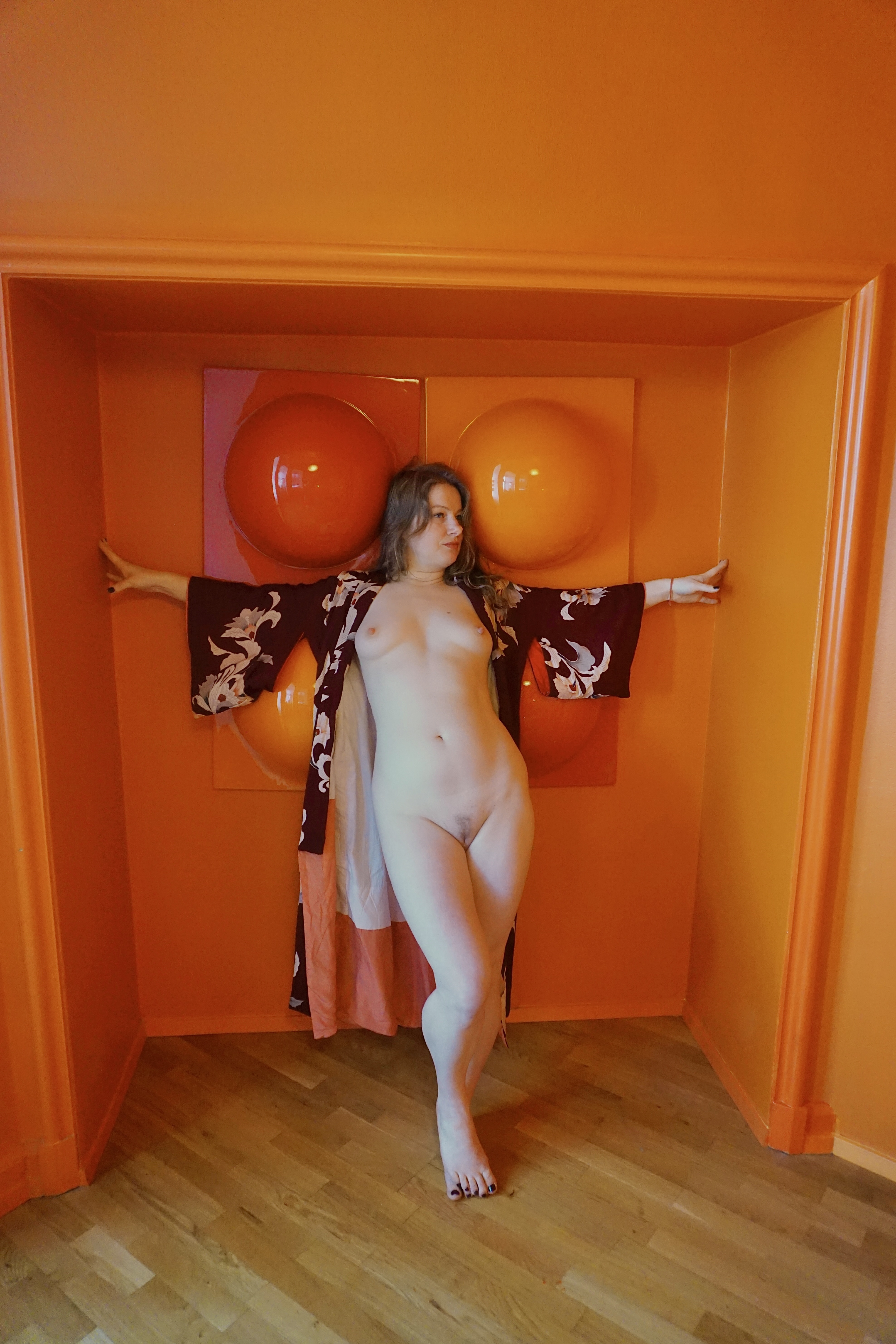
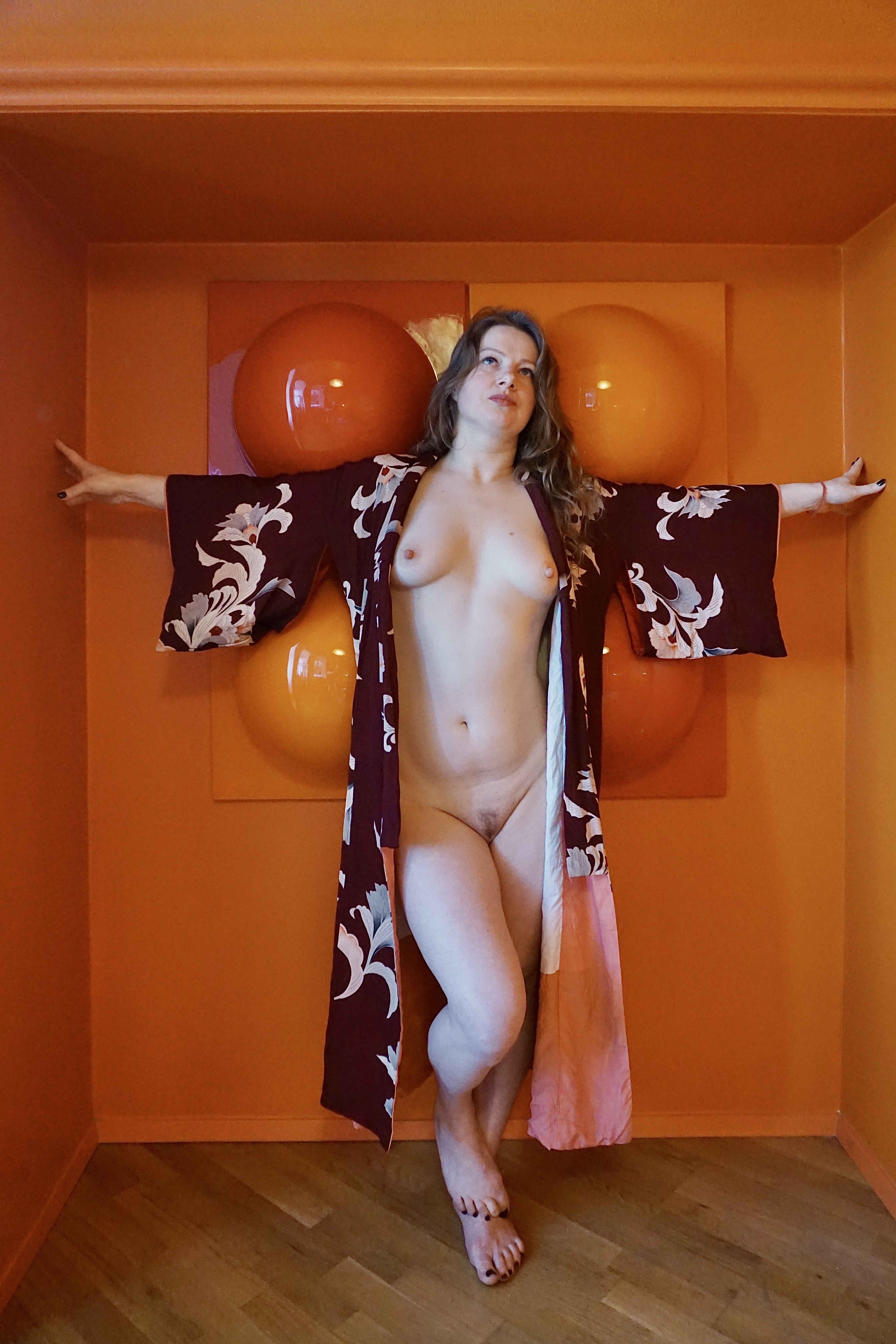
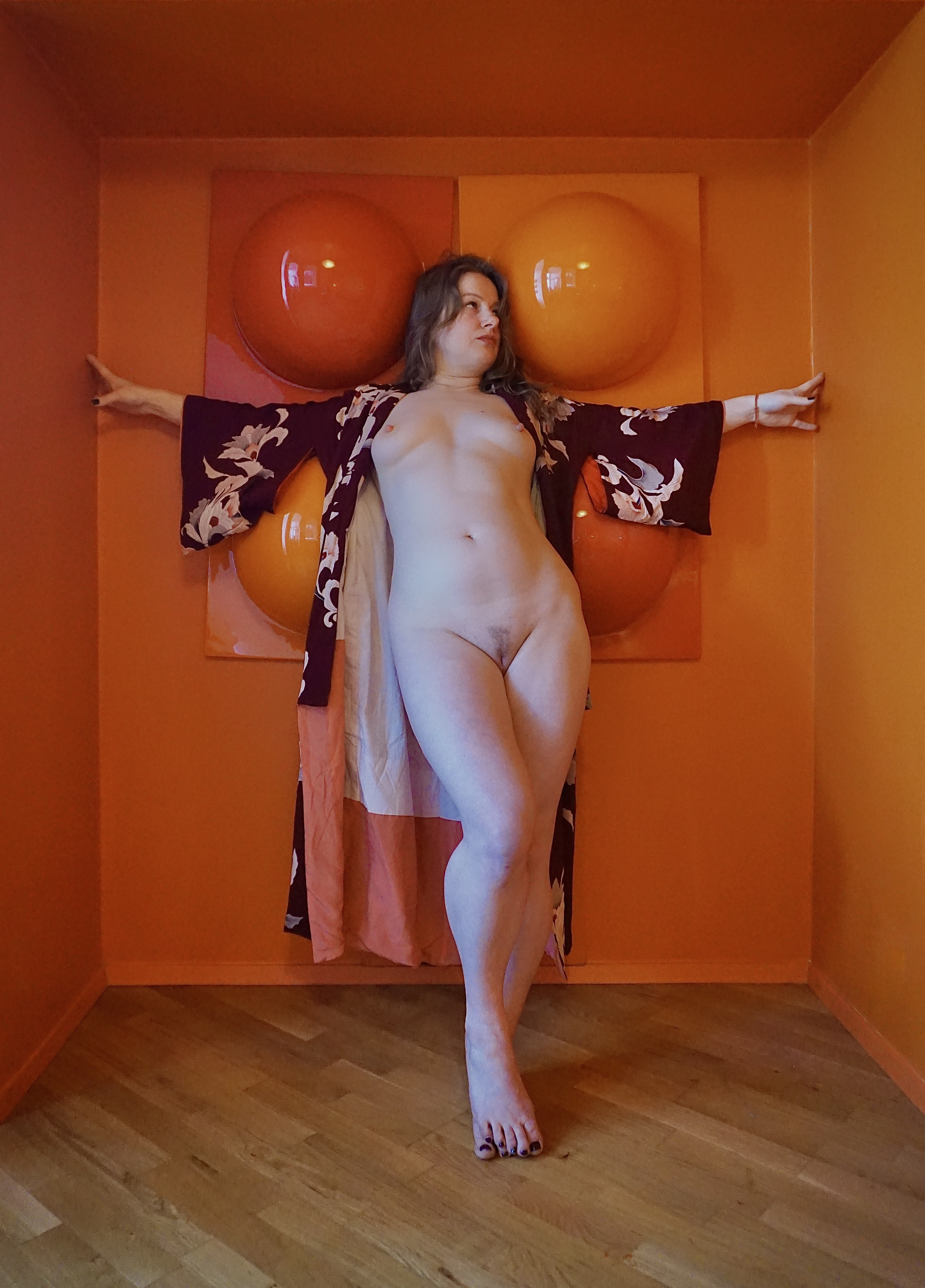
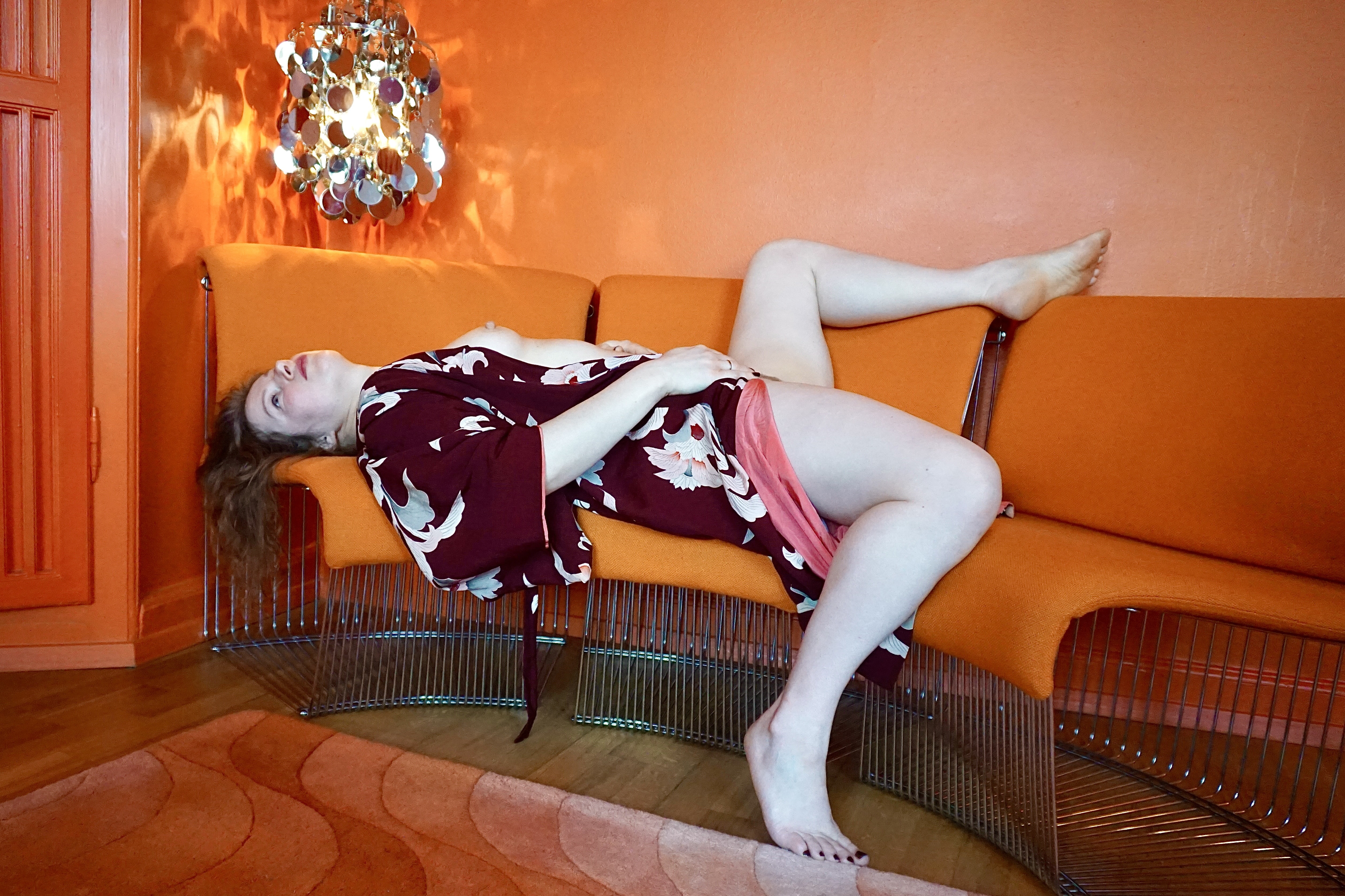
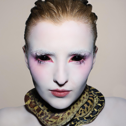
Chromatic Skin
Photographer
Daniel Gilpin
Category
Fine Art Photography - Nudes
Company
Submission Group
Amateur
Year
2025
Country / Region:
Denmark
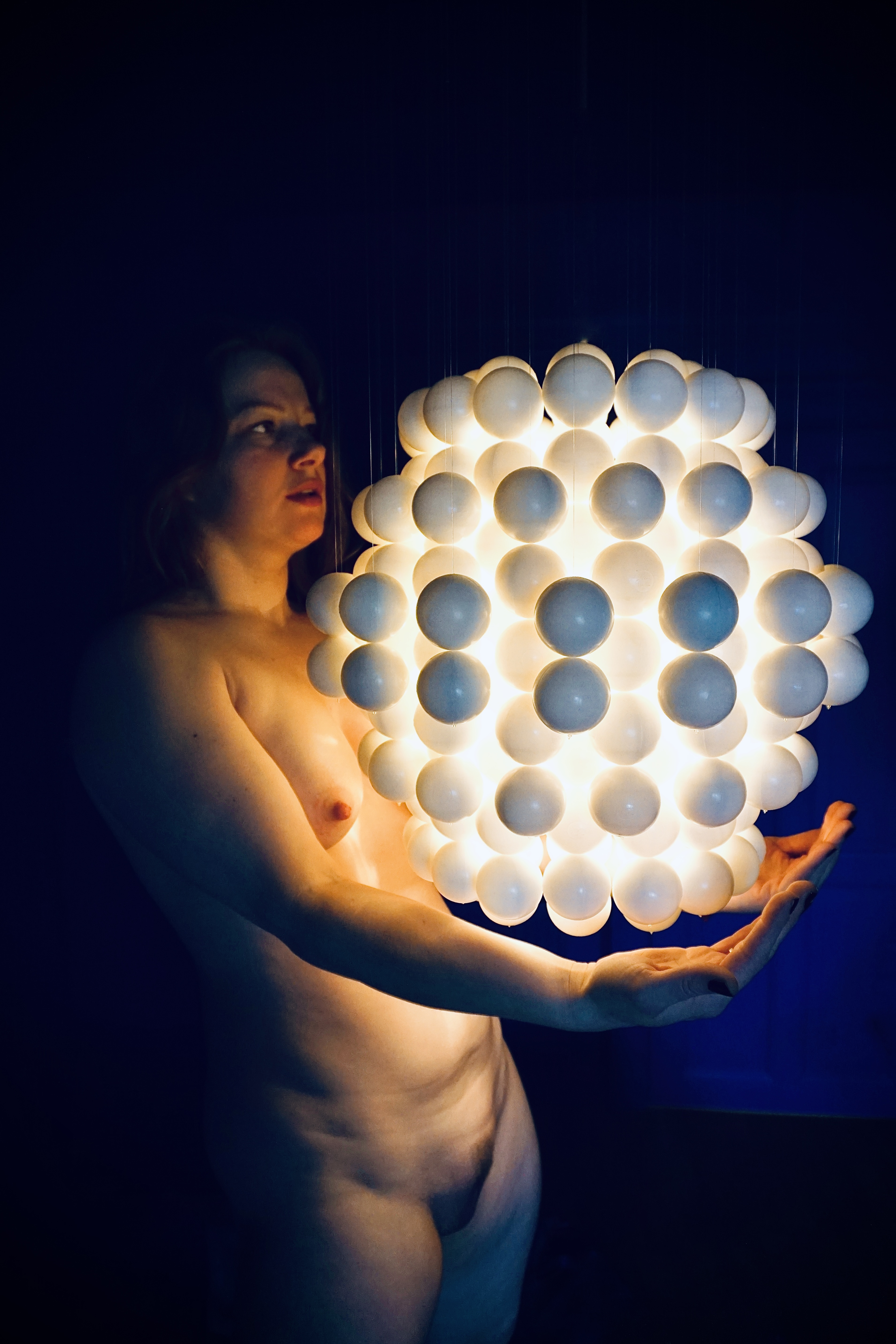
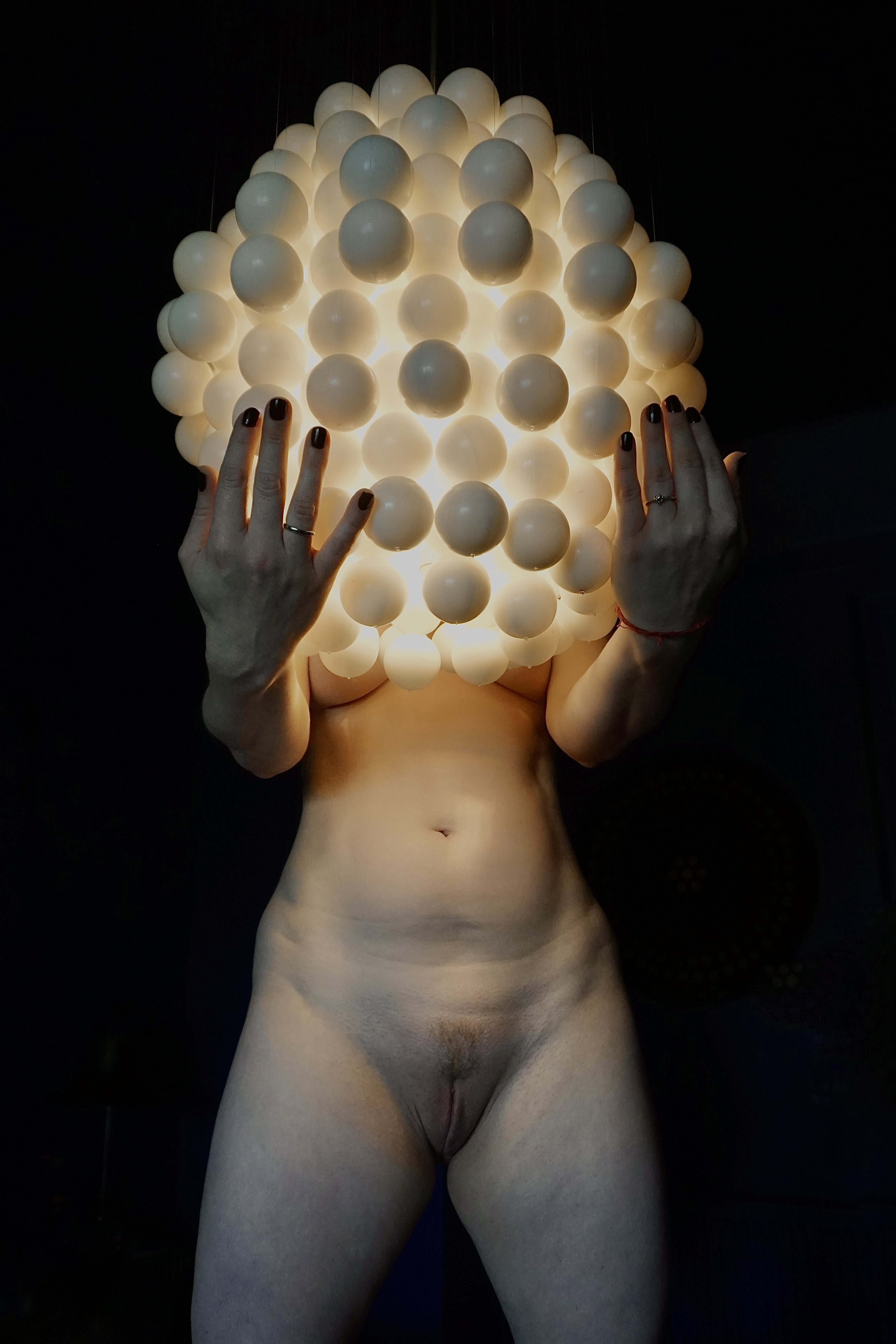
I’ve always been drawn to colour ... not just as decoration, but as emotion, memory, and energy. I studied colour theory in art school, and it continues to resonate deeply in my work. This series draws inspiration from the bold, expressive design languages of the 1960s and 1970s eras where colour wasn’t afraid to take up space or challenge convention. Danish designer Verner Panton, with his fearless use of form and saturated hues, is a good example of someone who has influenced my aesthetic. His work taught me that colour can be both playful and powerful that it can shape how we feel in a space or within an image. In these photographs, colour becomes a conversation between the muse and the viewer. The pale skin becomes a blank canvas ... fragile, human, honest ... while colour around introduces rhythm, contrast, and a quiet tension. Shapes echo design traditions but also invite something more personal: a mood, a memory, a sense of stillness or surprise. This series isn’t about perfection. It’s about presence. About how the human form and vibrant colour can co-exist ... not to decorate each other, but to reveal something deeper, something fleeting and emotional. I invite you to pause and simply look. Let your eye follow the curve of light, the interplay of skin and shade. Let colour speak to you—not loudly, but instinctively.
Photographer / Company
Kenichiro Tsukada
Category
Black & White Photography - Street
Country / Region
Japan
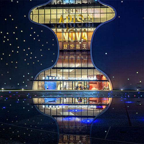
Photographer / Company
HO, WEI-CHIN
Category
Architecture Photography - Cityscapes
Country / Region
Taiwan
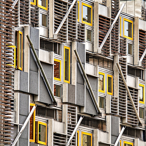
Photographer / Company
Glenn Goldman
Category
Fine Art Photography - Architecture
Country / Region
United States
Photographer / Company
David Boni
Category
London Photography - Music
Country / Region
United Kingdom